UX/UI Design
UX/UI Design for Verathon Medical
I led the redesign to make the site look better and work more smoothly. The project improved user experience, matched Verathon’s brand with the design, and met industry standards. The new design not only looks nicer but also works better for the business, using user research and heat maps to help Verathon.com serve its users more effectively.
Observe and Learn
Like all UX projects, we must check what works and what doesn’t. I began by reviewing the old website layout, studying heat maps, and analyzing the user journey.

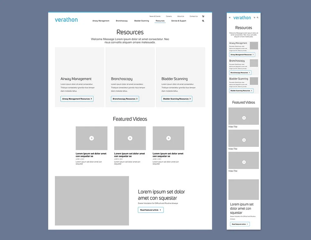
Wire Frame
After carefully learning how users navigate through the site and identifying what aspects work well or don’t, it’s time to move forward and create wireframes based on that valuable information.
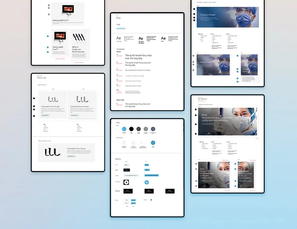
Figma Time
After carefully laying out the page and reviewing the flow and design concepts with the client, it’s now time to begin building your components and defining the styles in Figma.
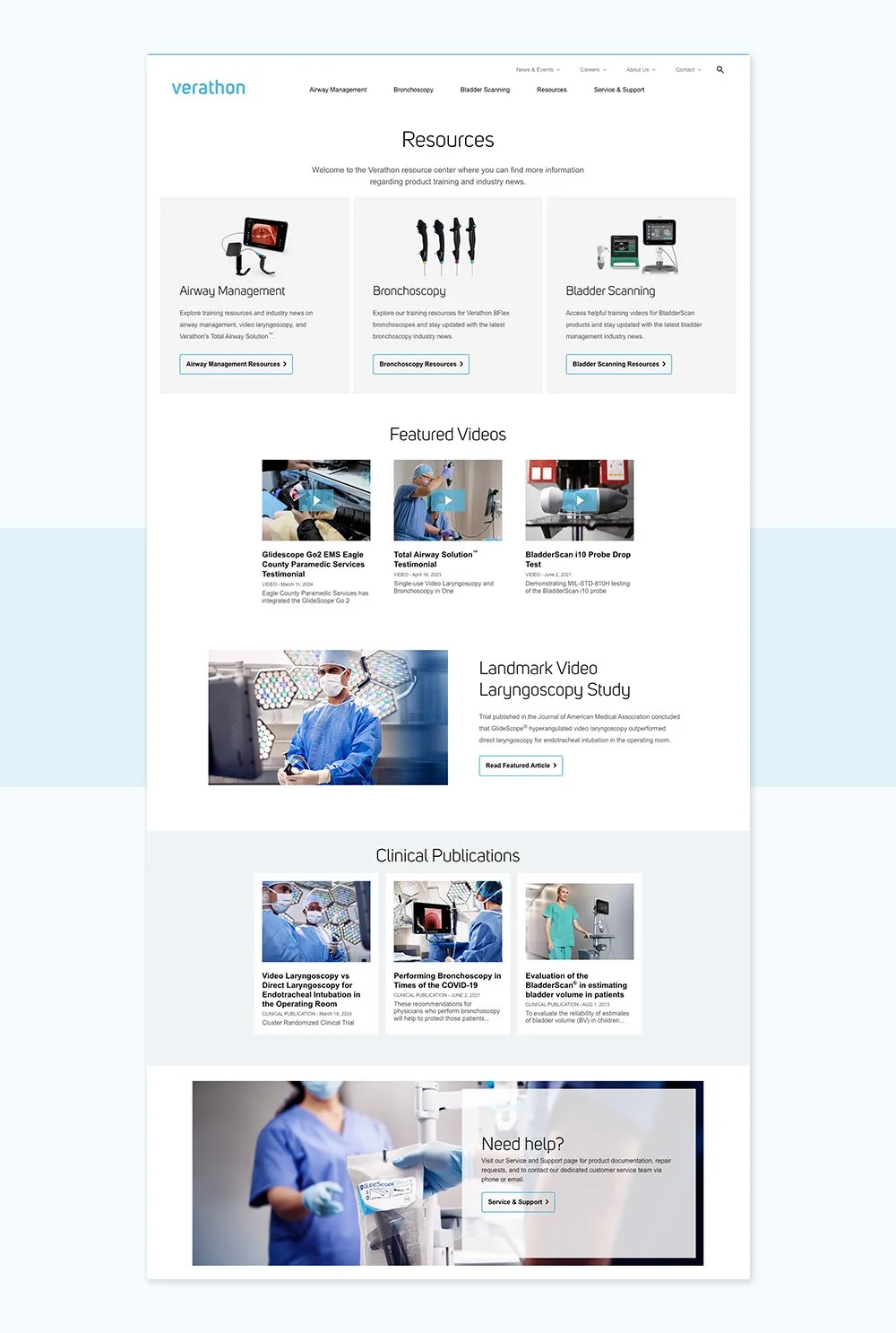
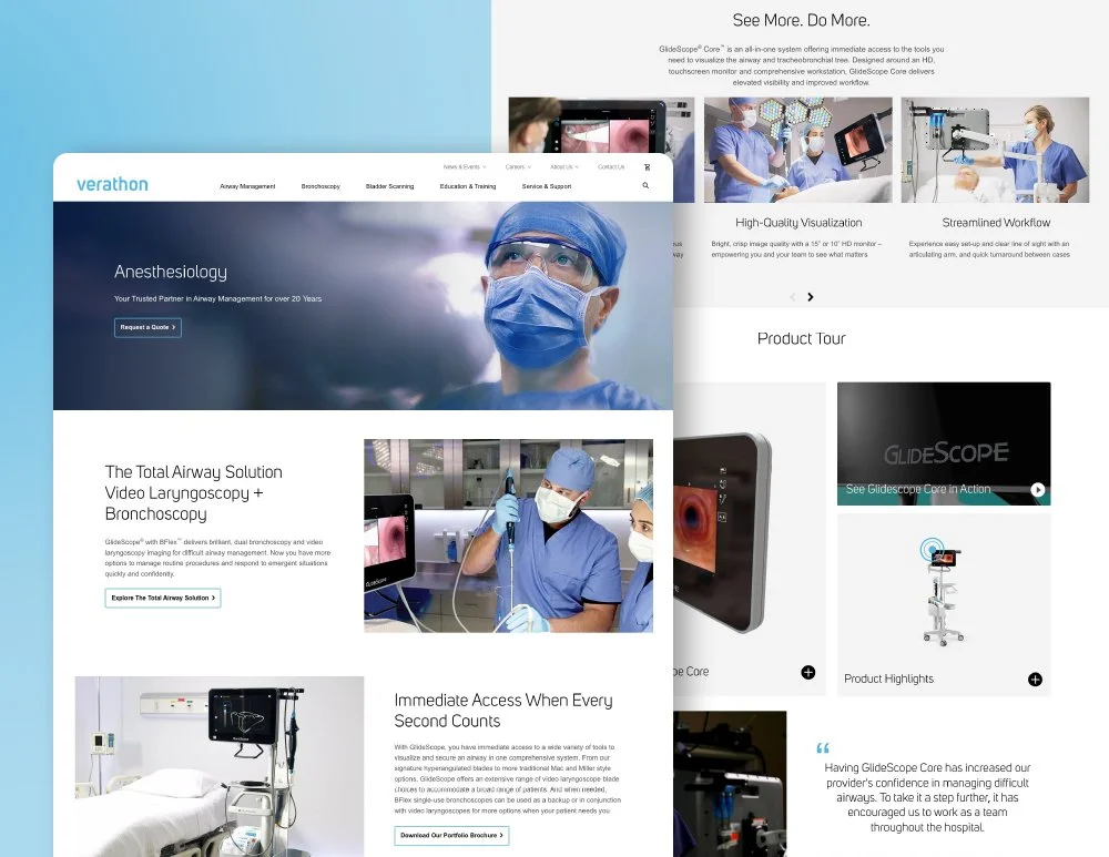
Everything Falling into Place
I begin by gathering photos, renders, and copy. Once collected, we start integrating these elements into the layout, carefully arranging and combining everything to create a polished, high fidelity design.
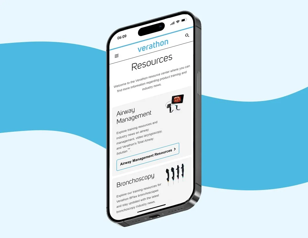
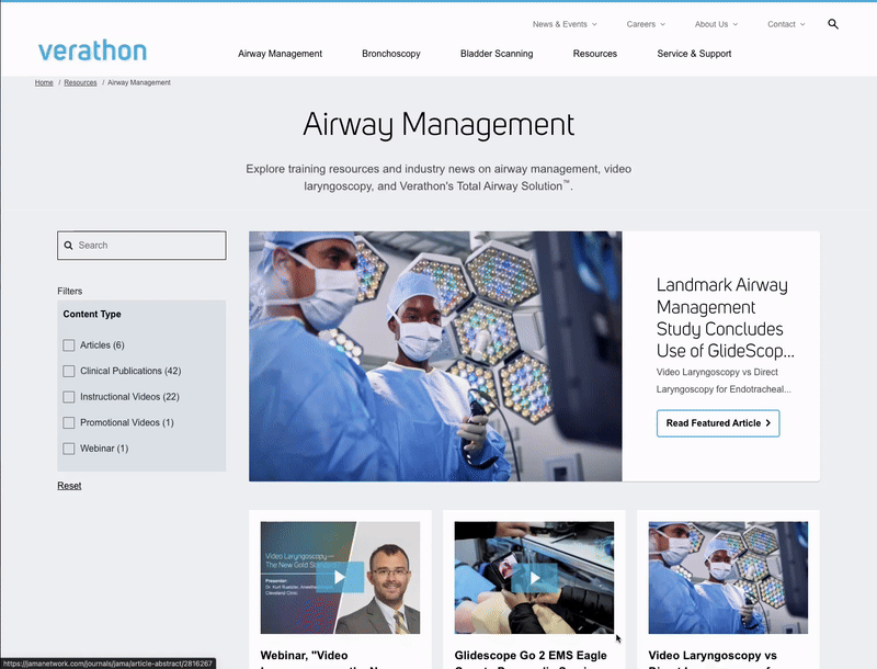
Test Functionality
I make sure to use Figma for prototyping all possible clicks and scenarios to ensure a smooth user experience. In this case, we observe the Verathon resources page dynamically change based on the newly implemented search feature, allowing users to find relevant content more efficiently.
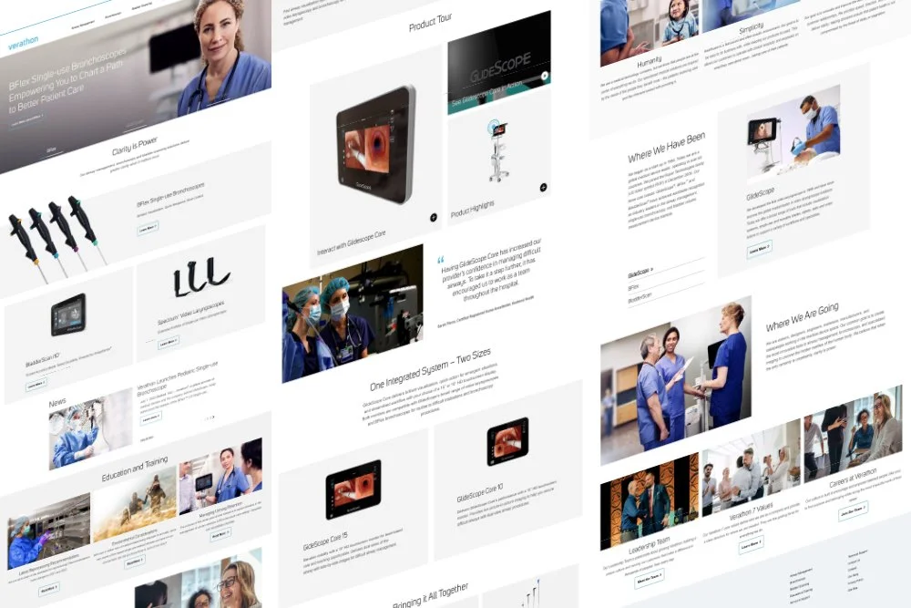
New and Improved
The site is now fully prepared and ready to be published with the support and collaboration of the development team. The updated layout and enhanced functionality are designed to help users navigate the site more easily and find exactly what they’re looking for with greater efficiency.